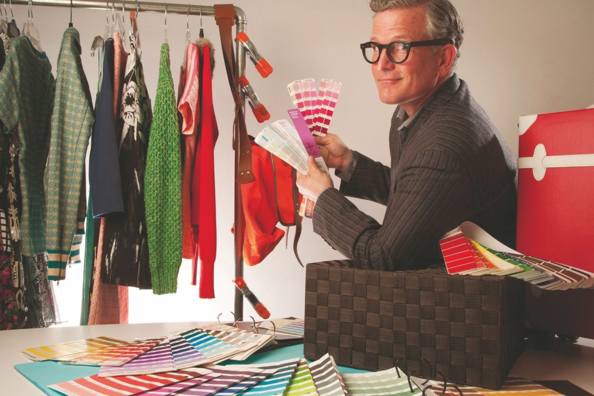

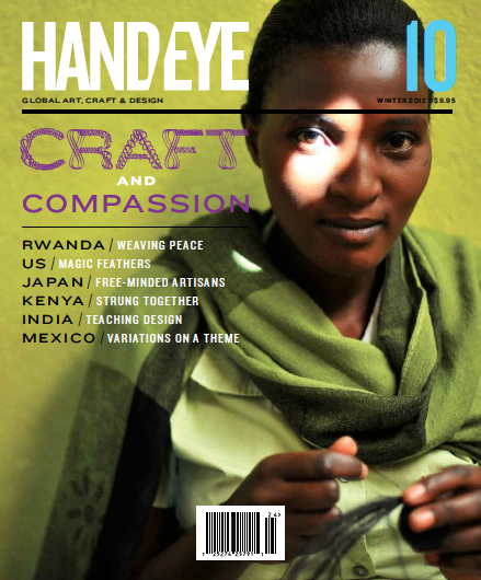
Keanan Duffty connected students from his Trend Analysis & Product Development classes with Keith Recker, the WGSN expert for color trends in the USA. Keith Recker works with Pantone and is co-author of “PANTONE: The Twentieth Century in Color” (Chronicle, 2011), published in eight languages. Recker is the founder and editor of HAND/EYE Magazine, a journal devoted to global art, craft, design and creativity.
Alex Snyder: What Was Your Most Successful Color Forecast?
Keith Recker: The answer is always “the one I am about to complete.” There’s a moment about 40 percent of the way through the forecasting process where the narrative lines start to cohere, the pile of what’s NOT going to be included feels appropriate, and each idea is still alive with poetry and potential. Ideas are still fluidly recombinant, and I can smell the relevance of what’s coming together. I love that moment.
To answer your question more in the way you meant it, I would say that Spring/Summer 2014 was a terrific forecast – and there is evidence in fashion week coverage that much of what I thought I saw coming down the road actually did appear. There’s a sophisticated techno-filtering of nature and natural elements that informs the season’s most exciting colors, as well as an emphasis on the simplicity of black and white, and navy.
You were too polite to ask about my least successful forecast, and I thank you for that. No one has a perfect track record. The most amazing trend forecaster working today is Li Edelkoort. A few years ago she posted a German television program which looked at the fruition of various phenomenon she’d forecasted. If memory serves, she got a B+. Every forecaster I know works very hard for a B+ or better.
Carrie Lin: In the past, color was selected for one year. Will Pantone increase the ‘color-life-cycle’ when they face the phenomenon of ‘fast fashion,’ which is quicker than before?
KR: As far back as I can remember color and trend have been investigated on a seasonal basis – twice a year. This evolved directly from a need to accommodate the seasonal weather fluctuations of Europe and North America. Warmer clothes and mostly darker colors are chosen for the chilly and light-deprived autumn-winter season, and cooler, breathable clothes with lighter colors for spring and summer. It stays with us, both because consumers need fashion that meets their needs as the weather changes, and also because the corporate structures of most fashion companies still evaluate their sales and plan their buys on a seasonal basis.
The phenomenon of fast fashion hasn’t much changed this outlook. While there are more deliveries per season, these deliveries are designed and approved within the overarching structure of two cycles a year.
Pantone and WGSN, the two groups I work with, function mostly within the constraints of the seasonal approach. Forecasts are designed to capture not just one point of view/storyline/aesthetic presentation per the season – but six or eight. Fast fashion houses seem to adapt the options to suit their delivery schedules to ensure variety and evolution across the season so that their audiences stay engaged.
What has changed recently is the pressure for quality and relevance in the forecasting world. No manufacturer or retailer can afford a failed season, so forecasts need to be well researched and well justified, and to tread the line between inspiration and salability with great care.
Ana Clara Backes Martins: What advice would you give to someone who is looking to start a business making hand produced garments and textiles?
KR: A recent article about Eileen Fisher described her first trade show appearance in a shared booth with four samples adapted from existing clothing and sewn out of linen in a small workshop. There is a beauty in starting small and growing with care. There’s a beauty in cultivating a customer base through serving them with talent and insight, but also listening to them so that you are responding to their needs even as you are pursuing your own vision.
Troy Hines II: Where do you find inspiration and trends for future color palettes?
KR: First, I read a minimum of three newspapers a day. Ingesting the narrative of the times is important. What is happening in the world? How are people reacting to events? What inner needs are being created in their wake? What do people aspire to? What values do these aspirations express? How do the facts, the events, the reactions, the aspirations cohere into narratives that can be expressed visually? Can these visual expressions serve as the raw material for designers, manufacturers and retailers to push their disciplines forward in relevant ways?
Basing my thinking in what’s happening – on as broad and global a scale as I can – helps eliminate the problem represented by the thought “I like that.” Like everyone else, I am just one person. That person happens to be white, male, gay, (mostly) American, and fifty years old. Like everyone else, I am rooted (mostly) in a place and a time. But I need to look at a much broader slice of the zeitgeist, including things I don’t necessarily like or agree with, in order to be relevant. Finding ways to look well beyond the “I” is rewarding and expansive and improves what I produce.
Because forecasting is every bit as visual as it is thoughtful, I am on the hunt for images. I cut out and file any picture of any kind from any source that sets off a ping of interest in my head. Or I capture it and file it. Or I take the photos myself. I think I have about 200 pounds of pictures spread out on my worktables right now, and I always moan about wishing I had more.
Out of this miasma comes a forecast!
The great thing about working with WGSN is that what I come up with is shared with an international, multidisciplinary group of talented people, some of whom are bringing their own forecasts to the table. We work together to combine and focus and refine and create the clearest, most useful narratives we can. Pantone works in a similar way to create its forecasts.
Shu Hsuau: Does Pantone’s color influence the trend of cosmetics and hair color?
KR: Pantone has a relationship with Sephora which puts Pantone’s Color of the Year on store shelves exactly when that color is announced every December (for the following year). So in a very real, matter-of-fact way: yes.
Because fashion and beauty go hand in hand, Pantone’s forecasting influence will be felt in both disciplines.
Judy Chiu: Is there any certain color for a season?
KR: No color is right all the time! Black is fairly dependable…but we just saw several fashion seasons where it looked dull and listless compared to neons and saturated jewel tones. Red is often cited as the most salable color in the United States – but blue is certainly putting up a fight for that title lately. Since our thirst for color changes with our emotional/social/psycho-spiritual needs, we can’t take very much for granted.
If we narrow the scope of the question down to the parameters of a specific collection or a specific brand, the answer has a greater chance of being yes. Menswear usually needs its grey and navy. Eveningwear for women will generally be receptive to blacks, and a jolt of red. The interesting brands cantilever their offerings off of a base of “certainties” and into unexplored spaces: maybe, just to stay relevant, that evening wear red turns smoky and is juxtaposed with an earthy value of chartreuse. Which takes us back, in the context of color, to the idea of treading the line between inspiring and salable.
Midori Angevine: Do cultural backgrounds influence your color forecasting? (for example the forecasts created for Africa, Israel, etc.)
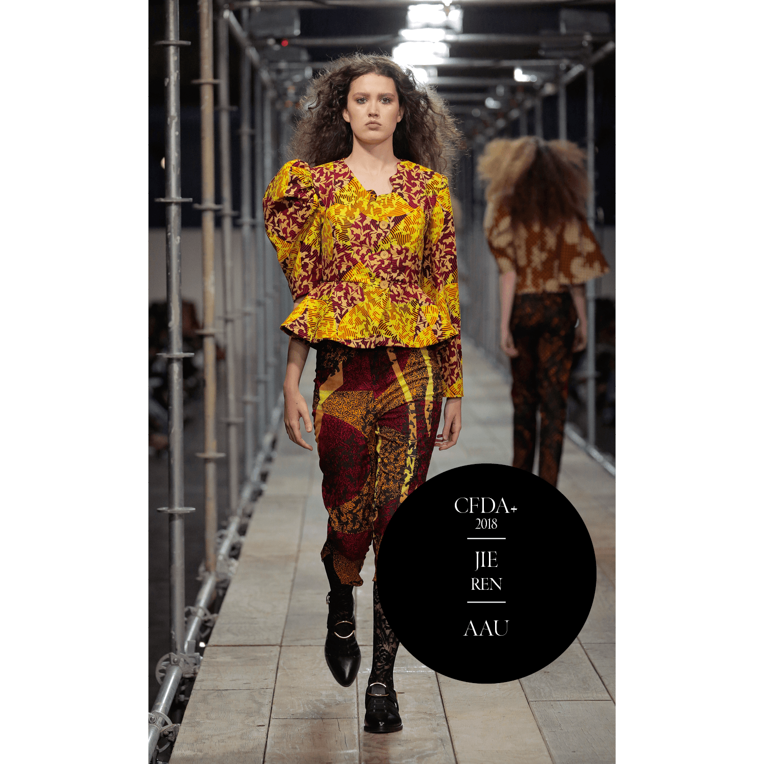
KR: In a globalized world, influences come from everywhere. Sometimes a cultural message is translated more literally than others. Ralph Lauren’s beautiful Masai-insired collections from the late 90s always come to mind when we talk about cultural influence: he managed to translate the colors and beading patterns of pastoral East African nomads in the most relevant, inspiring, sensational and salable way. Magic. Same with Oscar de la Renta’s use of indigo shibori a couple of seasons ago.
Sometimes cultural inspiration expresses itself more obliquely. There’s been a fairly steady interest in West African prints in the last few years, for example. The sharp yellow-greens you see in active wear are arguably derived from the “real Dutch wax” prints seen in francophone West Africa…not that your average Soul Cycler would necessarily make the connection! She is just appreciating the verve, the life force, the sense of joy and positivity that the color brings.
In addition to being a trend and color forecaster, I am also the Editor and Founder of HAND/EYE Magazine, which documents global art, craft and design – with particular attention to creativity in the so-called developing world. The prism of other cultures is a part of my daily bread, so I hope that culture, in a broad and inclusive way, infuses what I do.
Yue Yu: What is the difference between European and American fashion?
KR: That’s a big question – and one that fashion editors and journalists have spoken about at least since the Gilded Age days of Edith Wharton. I hesitate to put my toe in those waters!
From a color point of view, I can say that I have noticed some inconsistent differences. Midtones and pastels in Europe tend to be more patinaed, oxidized, laundered: there is more room for smoky, faded subtlety. US core colors tend to be cleaner and more direct, but not always. Northern European and German brights can seem overbold and unflattering to American eyes, but not always. US brights can seem juvenile and unintellectual in Europe, but not always.
Because our emotional needs change, the value judgment we place on colors changes. As I said before, nothing is completely dependable. We have to use our emotional sensors and our data-gathering capacities and formulate a fresh take on things as much as possible.
Tove Hernlund: You work with color, so how about off work? What type of interior design do you like, colorful or simplistic? Is your wardrobe a direct reflection of the colors you predict to be on trend, or something completely different?
KR: When it comes to interiors, I aspire to achieve a Minimalist strategy of pristine white and absolute black. In actuality, we have a child, two dogs, and a cat, and we live in a renovated 19th-century farmhouse. I do not think I will achieve my aspiration anytime soon.
When it comes to wardrobe, I opt for a uniform. Indigo inspires me: it has depth and life. It is used so beautifully in Africa, Asia and Latin America. I am wearing almost nothing but these days. This eliminates some of the interference that comes from the “I like this” line of thinking: I can stay more focused on what’s happening and how people are reacting to it, rather than on what I am going to wear.
Miranda Robinson: Do you have the final say regarding Pantone’s color forecasting direction? Are there ever heated arguments over differing points of view?
KR: The final decisions at Pantone are taken by Leatrice Eiseman, the esteemed director of the Pantone Color Institute for many years, and my co-author on “PANTONE: The Twentieth Century in Color” (Chronicle Books, 2011). She brings a lifetime of experience in color matters, and a wonderful point of view. I adore her.
Do we disagree? I answer with a loving smile: You betcha.
Amberdeen: What is your all time favorite color?
KR: The hardest question of all! My soul leaps with joy in the presence of grass green, leaf green, moss green, jade, malachite and serpentine. My worries are eased by the pale blue of a clear summer sky at 9 a.m. My mind is cleansed at any hour by white. My creativity is nourished by smoky indigo.