Very few fashion stylists can say they’ve worked on set for the likes of Porter Magazine, ELLE, and the San Francisco Chronicle—but BFA Fashion Styling student Britt Moore can. Moore is also signed as the Head Stylist at Look Artists Agency and is the Contributing Fashion Editor for Forbes Magazine—mind you, she’s still in her early 20s. To say she’s extraordinary would be an understatement.
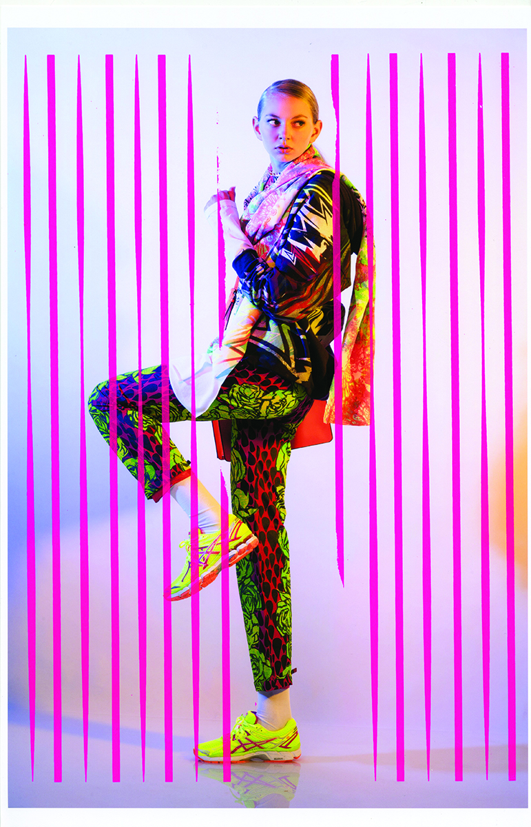
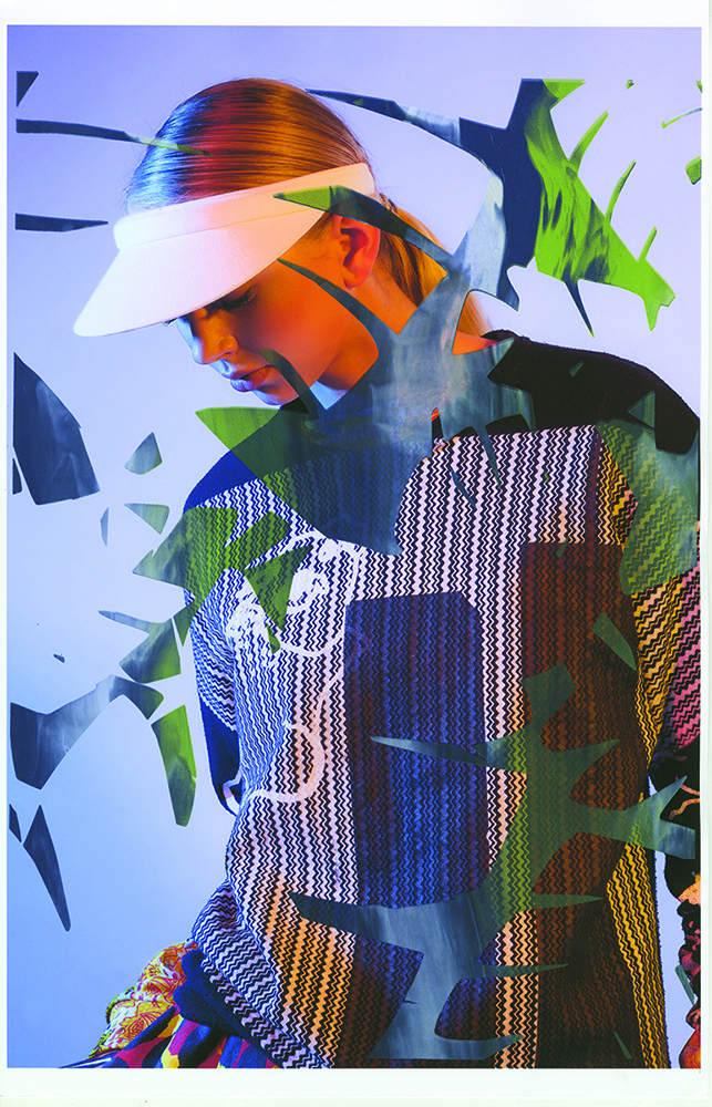
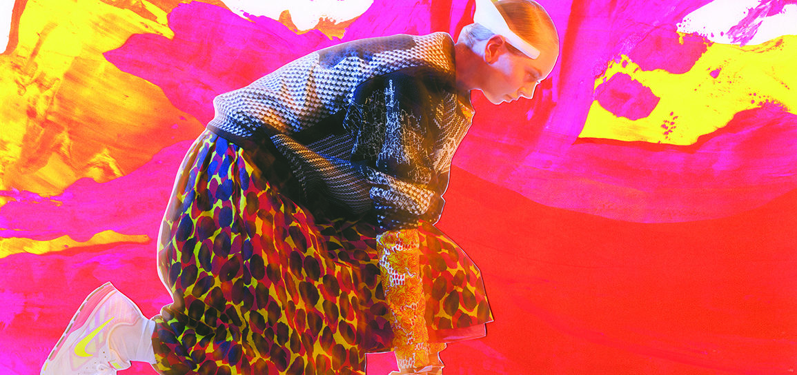
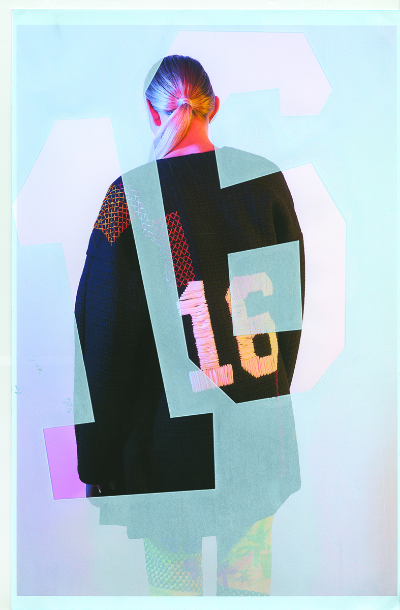
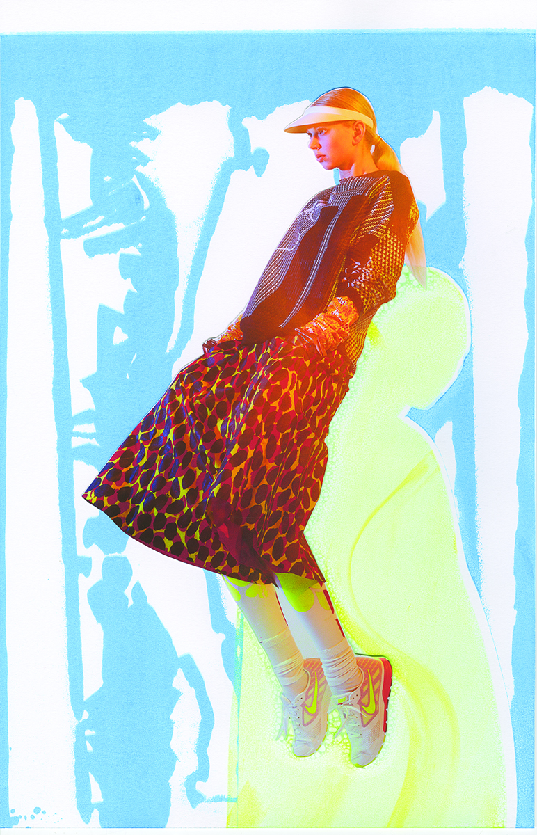
As one of the most compelling stylists at the School of Fashion, Moore was given the opportunity to showcase her boundless imagination in an editorial spread for 180 Magazine’s NYFW issue. With the help of Photography alumni Sarah Brickey, Jeffry Raposas, and Textile Design alumna Mariana Pasos, Moore was able to bring striking textiles to life in a stunning, delightfully eccentric photo shoot, “Print Is The New Black.’
Graduation is on the horizon for Moore, and she’s on the cusp of a new phase in her career. Before she bids adieu to Academy of Art University, she sat down with Styling Instructor Danielle Wallis to talk about the inspiration and process behind her 180 Magazine shoot and to share valuable advice for aspiring fashion stylists.
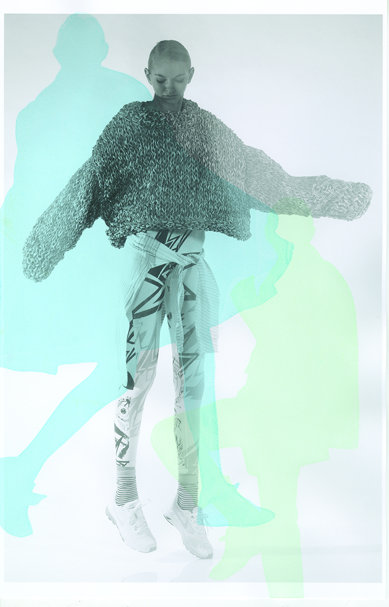
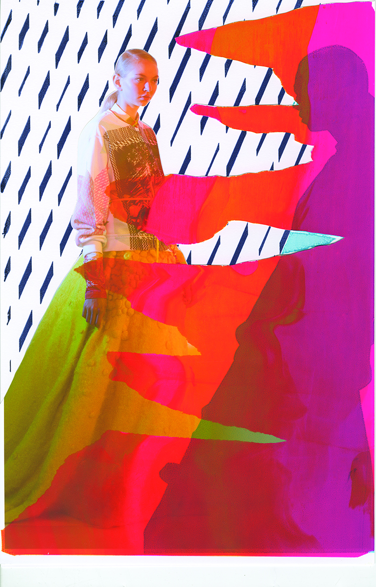
Danielle Wallis: What was your initial concept/inspiration for the photo shoot?
Britt Moore: My original concept for this shoot was collaging together unexpected patterns and bold colors. I strayed away from the collaging idea and focused more on the mixing of patterns.
DW: How would you describe the style and aesthetic of the shoot? (Lighting, art direction, posing, etc.)
BM: The style and aesthetic of the shoot is a play on “randomness.” The art direction I had in mind was to bring in playful elements (i.e. the red dinosaur purse and the “lips” bag). I figured the pieces were playful and extreme, so why not play it up even more? The colored lighting definitely emphasized the idea as well.
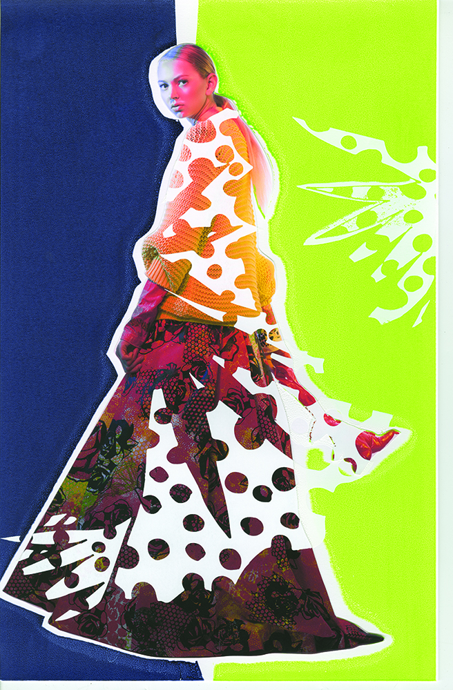
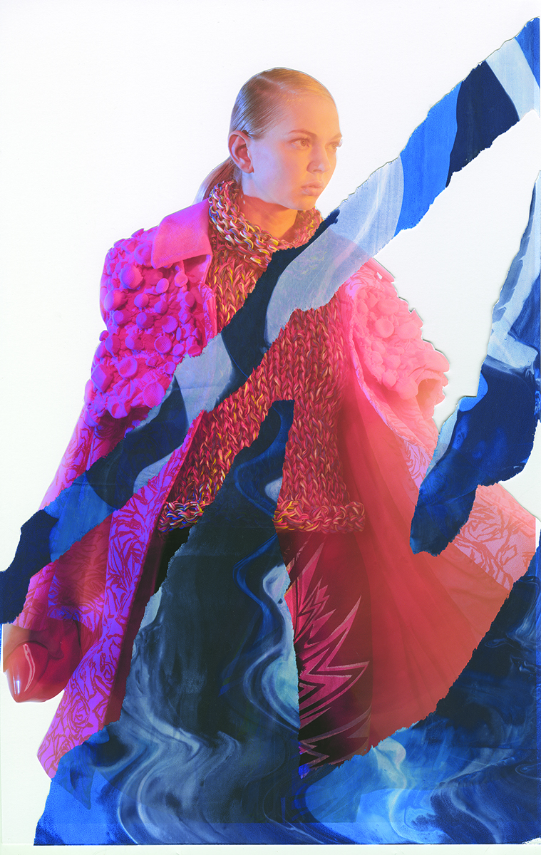
DW: For the shoot, you worked with pieces from the collections of Jaci Hodges (MFA Fashion Design) and Nisha Hanna Btesh (MFA Textile Design), Nancy Garcia (MFA Fashion Design), Jinhyun Kim (MFA Fashion Design), and Textile designer Ben Copperwheat. How was the styling process with such color rich garments? What was your strategy for mixing such bold prints together?
BM: Initially, I was a little overwhelmed. I absolutely love a vibrant color story for an editorial, but I struggled to find something that could ground the looks. While I was styling the looks and reworking everything, I realized that I should first focus on classic silhouettes that make sense. Having that as the starting point helped all of the vibrant colors and patterns fall into place with each other.
DW: What words of advice would you like to share with fellow Styling students about the process of styling for a publication?
BM: I would say that they should devote enough time to style each look beforehand. Really get into it! When you have your garments pulled, try to style as many looks as possible and then edit down for what makes sense for the concept/story. I styled about 15 looks before we decided which ones would fit into the editorial. Also, be sure to keep the magazine’s aesthetic and audience in mind.
DW: Which Fashion Styling classes helped you best prepare for this editorial? What skills did you apply that you’ve learned here at AAU?
BM: The FSH 284 Photo Shoot Production class helped prepare me the most. I learned how to build a concept and execute it from start to finish, and that played a big part in how I approached this editorial. Having produced and styled a lot from that class (and outside of class) was great practice and made it easier for me to produce the concept and styling for the 180 Magazine editorial.
DW: Do you have any general comments or advice you would like to share with your peers in the Fashion Styling program?
BM: Don’t lose your creativity! It’s important to be able to access amazing clothes, but don’t forget to really go for interesting concepts. Stay away from creating content that’s already been done and seen before. And remember, your sketchbook is your best friend. I still use mine!
