Energetic Angles
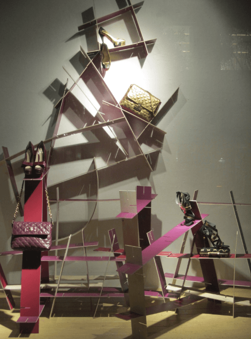
This week, I tried to contain my urge to write a Halloween-themed post and instead, cover other beautiful window display themes in San Francisco. (Since I’m one of those people who starts conceptualizing and sketching Halloween costume ideas in mid July, this has not been an easy task.) Visual Merchandisers seem to love their Halloween themed windows, but I couldn’t help but bring attention to the great work that’s being squeezed in right before the holiday display installs begin!
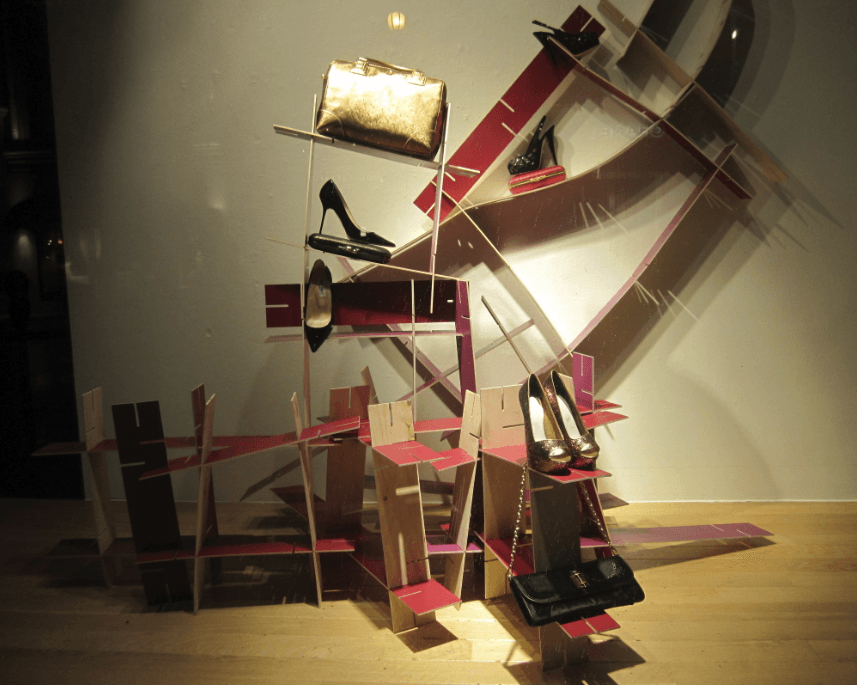
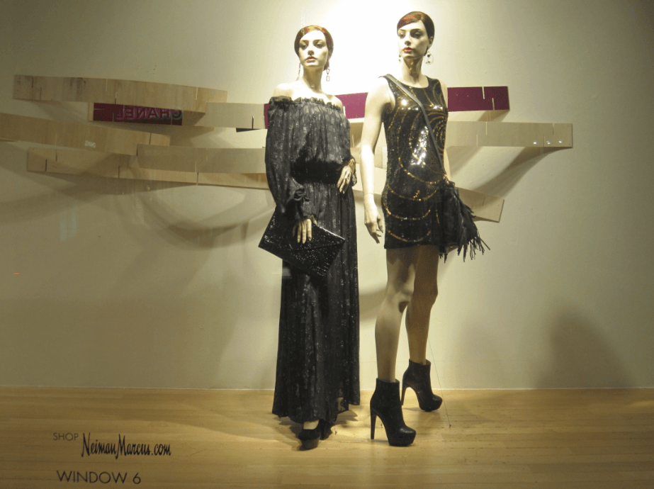
Neiman Marcus has infused a bit of youth and texture into their Geary Street window displays. And by youth, I mean that I feel a bit of an Urban Outfitters effect here with the raw wood, and I’m into it! The directions of the placed wood planks are dynamic and energetic.
Follow the jump to read more!
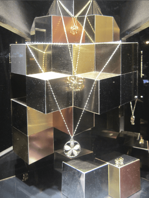
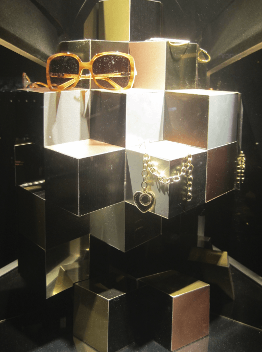
Tiffany’s is one of the few retailers that consistently makes me want to zoom in and take a closer look at their displays. This week, I was pleasantly surprised with their precious yet impressive box displays. Their new window displays feel rich, modern, and don’t include any pastel colors!.
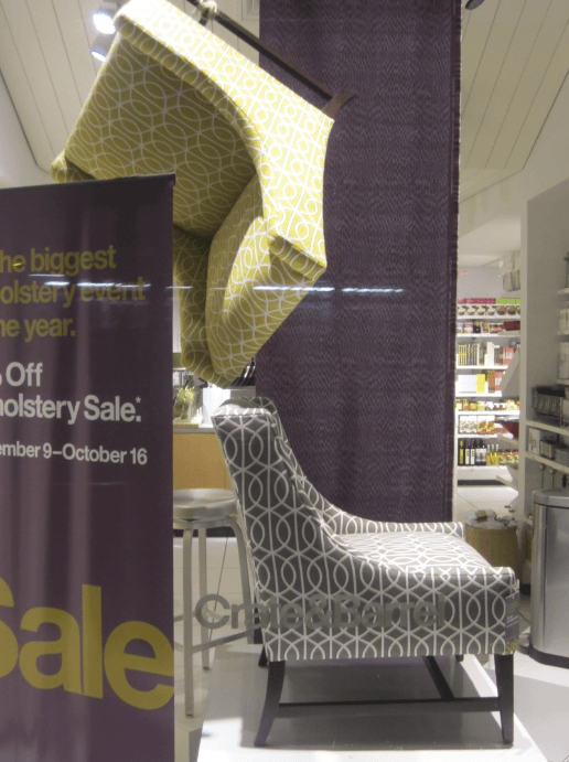
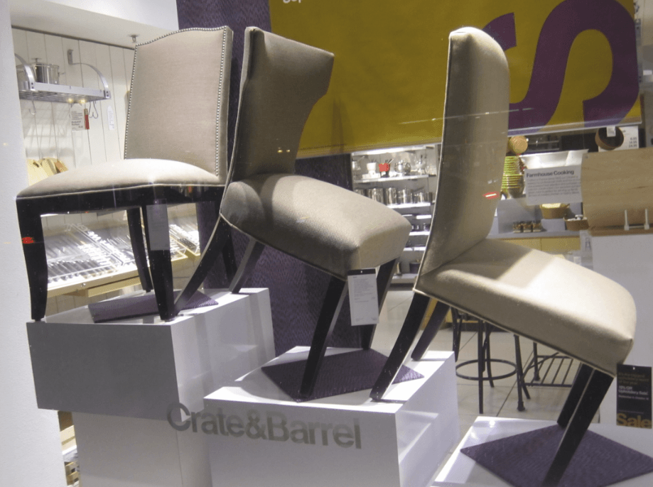
Lastly, I want to bring up the effort seen at Crate & Barrel! I’m not sure if I have ever seen the display team stack or tilt furniture, so this was an exciting moment for me. While revolving the displays around a Halloween-influenced color scheme (purple and yellow), chairs got a bit topsy-turvy on O’Farrell Street.
Written By: Danielle Wallis

