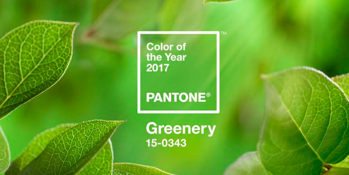
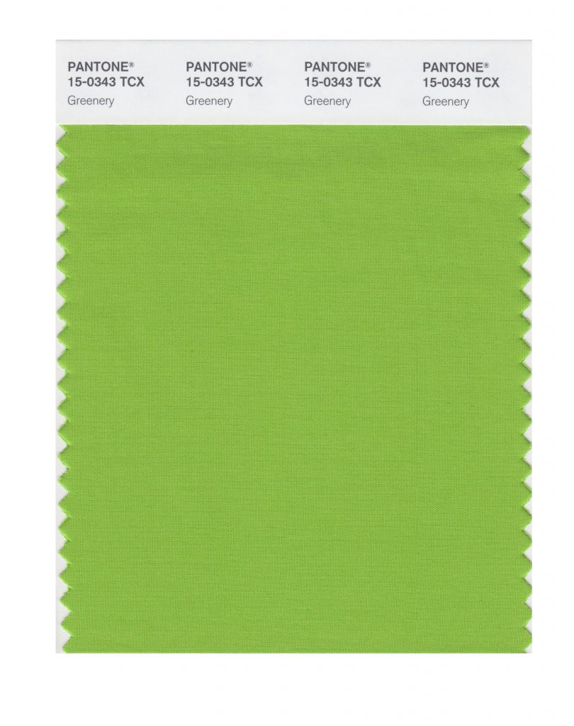
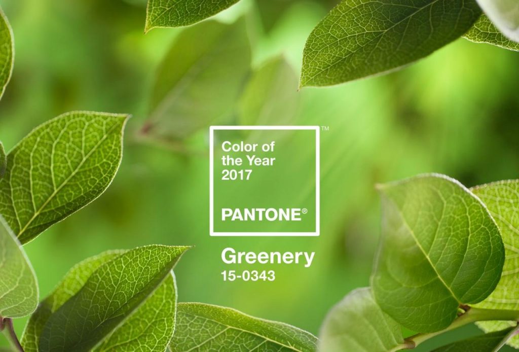
Dr. Seuss had the right idea way back when. One just had to give those green eggs and ham a try! After a tumultuous year for many in the creative industries, 2017 began with a promise of new beginnings. The Pantone Color Institute has announced that PANTONE 15-0343 would be the Color of the Year. Colloquially known as “Greenery”, it is described as a shade of green and yellow with blue undertones. A verdant solution to fashion woes?! Not so fast.
“Greenery bursts forth in 2017 to provide us with the hope we collectively yearn for amid a complex social and political landscape,” said Leatrice Eiseman, Executive Director of the Pantone Color Institute. As “nature’s neutral,” it may symbolize the reconnection with nature, one another and a larger purpose. In a technology driven culture, this color aims to promote a calmer lifestyle and embraces the reduce-reuse-recycle social responsibility mantra. “Greenery offers us self-assurance and boldness to live life on our own terms, during a time when we are redefining what makes us successful and happy,” concludes Eiseman.
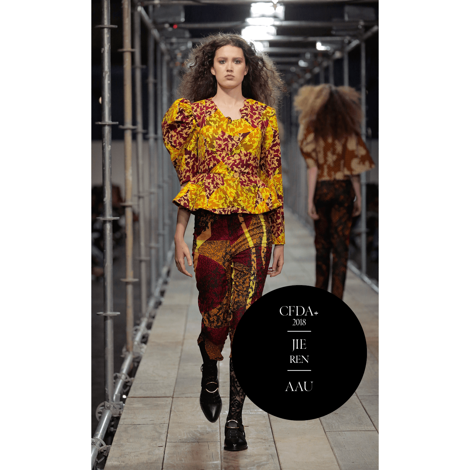
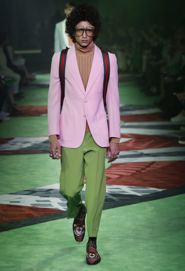
Although green is a common color for spring and summer, The New York Times fashion critic Vanessa Friedman noted that green had begun to make its way into the fashion limelight during the fall 2014 season. Subsequently, domestic popularity of the green juice cleanse, Matcha tea and miniature garden succulents has contributed to the color’s growing commercial prominence. Luxury brands such as Gucci, Cynthia Rowley and Michael Kors have already adapted the trend in their latest collections. Dior’s new makeup line even includes a lip color called “clover”.
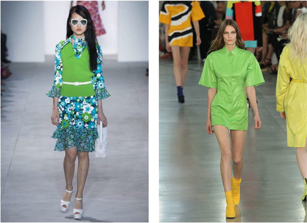
Unlike the 2016 pairing of Rose Quartz and Serenity, which excited most fashion aficionados, the current pick leaves many design professionals cold. Gary Miller, Director of the School of Fashion at the Academy of Art University, suggested that the color was “iconic, but not that appealing to everyone.” His own first impression was an image of Kermit the Frog. “Retail-wise a color like greenery in apparel performs poorly in the U.S. where St. Patrick’s Day is the only occasion that embraces green,” added Miller.
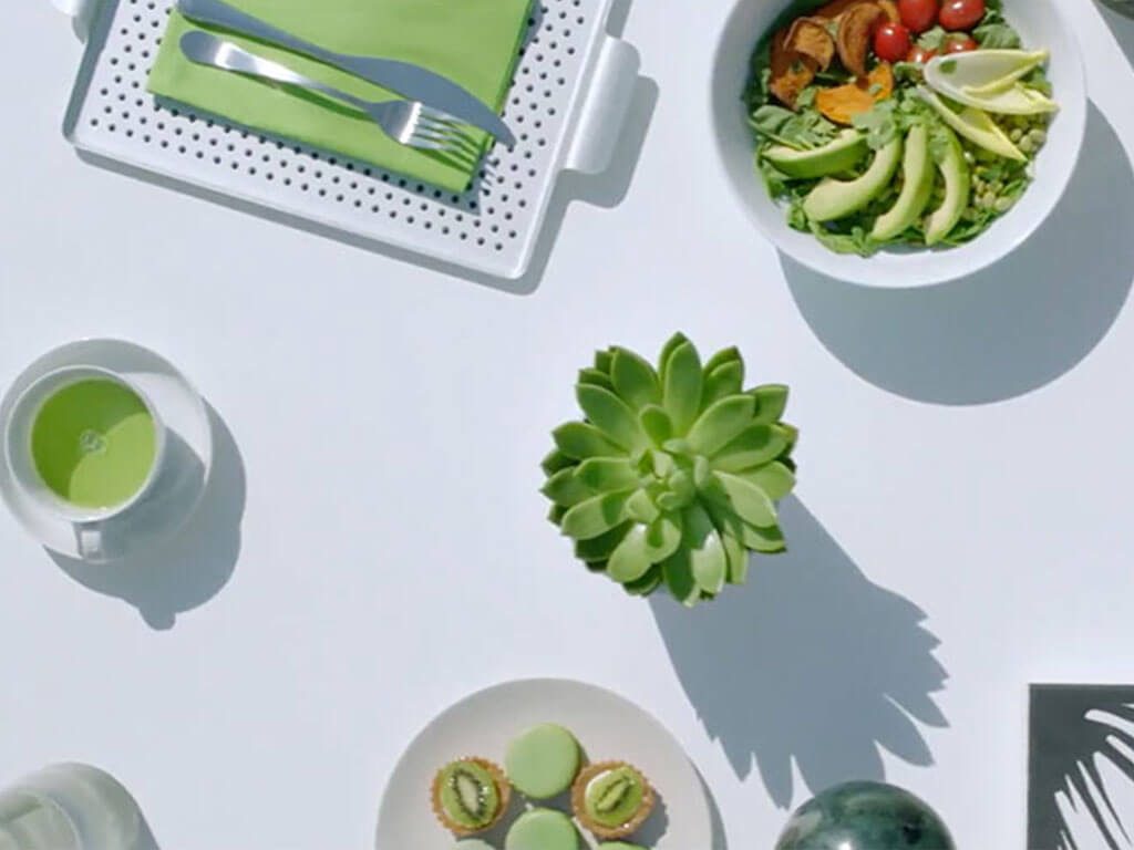
Academy students also contemplate the pros and cons of PANTONE 15-0343. Kevin Drake Diemert, a Fashion Design major, is on the fence when it comes to Greenery. “It is a lovely color which bodes well for home products, but it is difficult to wear. In terms of fashion sales, it is the Titanic to your White Star Line. It could be just right or the worst fashion decision of your life,” says Kevin.
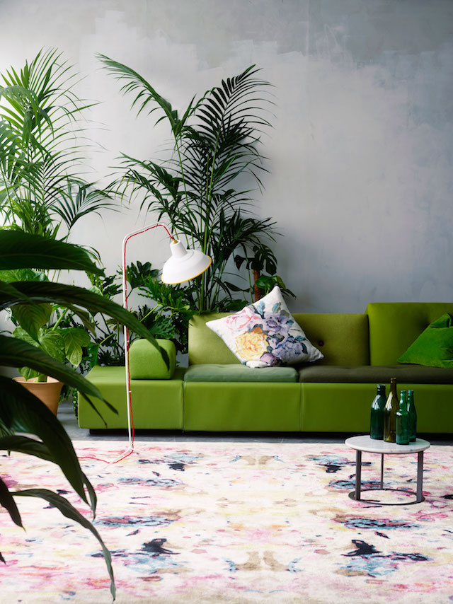
Meanwhile, the green color seems well-suited for interior design, architecture and home decor. In part, because it is believed to have a relaxing effect on the eyes. Juley McDonald, Assistant Manager at Pier 1 Imports, was very supportive of the Pantone Color Institute’s choice: “Green is quite the seductive color when it comes to textiles. It sells well as it’s young, energetic and vibrant. Although, the name itself seems very literal. I would’ve chosen a more creative term.”
After years of collectively advocating for “going green,” this moment could be a self-fulfilling prophesy. We should give it some time to settle in and see what good may come of it once designers get on board with the new idea. Those eggs and ham turned out alright, after all!
Text by Nivetha Sundar, MA Fashion Journalism

